Tuesday, August 31, 2010


Monday, August 30, 2010
PHOTO, FLASH, FOCUS, RECORD


Here are a couple more images of the Machete Screening courtesy of EribertoOriol.com.
Sunday, August 29, 2010
Saturday, August 28, 2010
TRAILER OF THE WEEK
If you dont know who you are going to go see this film with, you better get it together.
It will be in theaters in 7days.
Friday, August 27, 2010


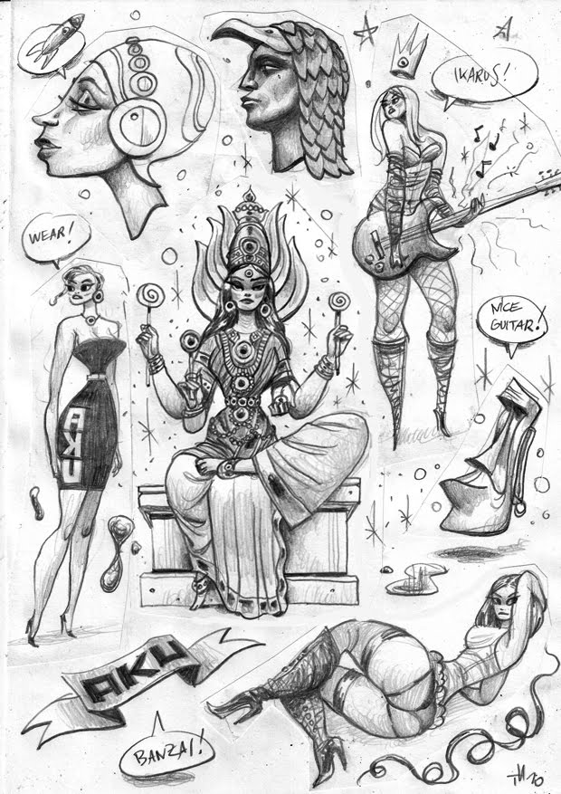
THORSTEN HASENKAMM
One of my favorite artists on the internet. I love his sketch pages, packed with great ideas and beautiful drawings.
http://thorstenhasenkamm.blogspot.com/


http://thorstenhasenkamm.blogspot.com/


Thursday, August 26, 2010
VIVA MACHETE


Just a couple pictures of last night.. Congrats to our good friend and"Mexican Super Hero" Danny Trejo Code Name: Machete on the film and thanks to everyone who participated. Also to my brothers and car club LIFESTYLE, gracias for making it happen.
Wednesday, August 25, 2010

George Ludway
The great, unknown Ludway. Sexy curves, appealing proportions and great flowy brush lines. Like Bob Tupper he spent the bulk of his career hacking for the Sex to Sexty mags, but at his best in the early 1960's, he's pretty fantastic.


Tuesday, August 24, 2010


Monday, August 23, 2010

Kishi Interview (Kakashi, Sasuke, Sakura)
1. Is Jiraiya dead?
Kishi : He lives..............................in your heart.
Naruto has to be grown up. Shikamaru also needed to be grown up. And Sakura will have to be grown up, too. Lee? Lee doesn't need to be grown up anymore.
2. What's gonna happen next year?
Kishi : Started with Sasuke vs Itachi battle.
I'm gonna write about mainly Sasuke next year. And Kakashi and Sakura, after that. Especially Kakashi. I can't tell yet but a huge event will happen to him.
3. What kind of way of ending do you do with Sasuke vs Itachi battle?
Kishi : I can't tell. But I have kept this waiting to manga readers for a long time. So I'll have to make everyone gets content with it.
4. Describe the color of Sasuke vs Itachi battle.
Kishi : Glossy-Black
5. Describe the color of Kakashi story which you just mentioned about.
Kishi : Dark Blue
6. You said you're gonna write about Sasuke, Kakashi and Sakura. What about Naruto?
Kishi : Naruto has to wait.
7. Are you gonna write the battle of each member of Hebi?
Kishi : Actually I didn't want to. But Shueisha ordered me to do with something about them.
Sunday, August 22, 2010

Saturday, August 21, 2010
Fun With Photoshop
Have you ever noticed how much teenybopper sensation Justin Bieber looks like that poster child of the checkout aisle tabloids, Bat Boy? This interesting revelation hit me recently when I saw this caricature by John Kricfalusi of the mop-topped little knucklehead. It immediately put me in mind of Bat Boy, who I believe is currently still on his mission of helping the U.S. military hunt down Osama Bin Laden in the caves of Afghanistan. Some quick Google searches turned up photos of both parties that I have combined here to prove my theory:
 I swear, they're practically twins, save for the mop-top hairdo. Of course, even that small discrepancy can be easily remedied with the help of Photoshop. So here now is my Frankensteined cobbling together of the two images, resulting in "Bat Beeb":
 Pretty cute, huh? Bat Beeb is sure to have all those pre-teen girls swoonin' over him, wishing they could give his big pointy ears a loving tweak. By the way, speaking of the Bieber kid, the overrated little twerp is playing tonight at Toronto's Air Canada Centre. My readers from around here may want to avoid that area of downtown until tomorrow. You have been warned.
Friday, August 20, 2010

Thursday, August 19, 2010
MAD... And Just Plain SAD
I grew up with MAD Magazine during its glory days of the 1970's, so it remains very much a part of what influenced me early on in my artistic yearnings. In fact, I credit MAD Magazine specifically as being the determining factor in my choosing to pursue a career as a print cartoonist over that of an animator after I finished school and had to make a decision on my career path. I still have every issue from about 1971 on up until sometime in the late 80's when I felt it was starting to decline a bit. I would occasionally pick it up in the years since (though not now), as many of my favourite cartoonists were still contributing their talent to it, including the following "Usual Gang of Idiots":
 Here's a cover by Mort Drucker. It wasn't too often that Mort illustrated the covers, so it was a real treat whenever he did one, adding some watercolour to his distinctive pen and ink linework. Mostly, Mort drew in the interior pages illustrating the MAD movie satire, presenting a caricatured comic book version of a new movie release. Mort has a huge following even today, and I'm glad to see the very talented Tom Richmond carrying on the movie satires tradition since Mort has gone into semi-retirement.
 This is a page from Jack Davis, my personal favourite of all the MAD cartoonists. Back in the 70's Jack Davis's art was everywhere: MAD, Time and TV Guide covers, magazine ads for various companies, even record album jackets. The guy was incredibly prolific and his art just sparkled with fun, personality, and great humour.
 Paul Coker, Jr. had a delightful style, and I used to borrow all sorts of tricks from his great pen and ink textures and use them in my own work back then. In addition to MAD, Paul was a popular cartoonist in the greeting cards market, as well as being the main designer that Rankin-Bass employed to create the art stylings of their stop-motion animated puppet holiday TV specials. (And also the hand-drawn Frosty The Snowman!)
 All my friends were really into the wacky cartoons of Don Martin back in those days. A pure cartoonist with a distinctive style, Don Martin also had a flair for creating descriptive words that expressed the appropriate sound effect for everything that happened in his strips. Tragically, we lost Don a few years ago.
 Antonio Prohias was a Cuban who somehow got out and made his way to America, where he rose to fame creating Spy vs. Spy, a satirical commentary on the absurdity of the longtime Cold War still going on at that time. To be honest, I often found his artwork to be a bit visually busy, and usually it took me more than one read to follow what was going on. (This is one of his clearer examples, which is why I scanned it in to show here.) However, I loved his great thick and thin ink line and bold graphic approach.
Which now brings me to my main reason for posting this stuff today. I just recently saw this promo clip posted on Cartoon Brew, which shows various animated snippets from a new MAD cartoon series coming up on The Cartoon Network:
To be blunt, I am very disheartened by what I see here. While I understand the sad reality of less and less money being put into creating anything for TV these days, especially animated, I don't think everything can be blamed solely on those diminished show budgets. Yes, it's typical of the "symbol" based animation that's employed on pretty much every show these days, with Flash, ToonBoom or similar software. And, yes, I'll admit that I am biased against this highly limited, "cutout" style and make no apologies for that. Yet, I have seen a number of shows that use these programs but still have a very professional graphic design style despite the symbol limitations.
Unfortunately, I can't be that generous in my assessment of what I see in these clips that I have to assume are quite representative of the look of the series itself. Animation aside, everything I see here is just poorly drawn. The characters look like they're drawn at the high school level, with awkward form and hastily traced outline; the layouts show poor composition and naive perspective (as opposed to deliberately skewed perspective like what Maurice Noble used to skillfully do.) It's rank amateurism that cannot be blamed completely on the lack of production dollars. And before I get bombarded with howls of protest from those who animated on the show under tight deadlines, may I point out that the newspaper doodle of imaginary critters in my last post was sketched in no more than 15 to 20 minutes tops over lunch. Yes, if kept simple, decent cartoons can be drawn in a short amount of time. Considering the repeated use of "symbol" animated pieces, there's really no excuse for not taking a bit of time to draw relatively simple cartoons like Spy vs. Spy and Don Martin and get them right from the get go.
In contrast, just take a look at this Spy vs. Spy segment that was animated for the MAD TV series that started in the mid 90's:
Frankly, I'm highly impressed with that series of short animated bits, as they were pretty full animation considering it was for TV. They're expertly drawn with a strong graphic look, retaining the comic's distinctive thick to thin linework. The background layouts are simple but dynamically staged, and the entire production reads clearly with visual appeal. In short, it looks like the work of skilled cartoonists, who, back then were still allowed to actually draw! How much we've lost even since then, going cheaper and cheaper, and having become way too dependent on the computer to do so much of what was done far better by the hand of an artist.
 Here's a cover by Mort Drucker. It wasn't too often that Mort illustrated the covers, so it was a real treat whenever he did one, adding some watercolour to his distinctive pen and ink linework. Mostly, Mort drew in the interior pages illustrating the MAD movie satire, presenting a caricatured comic book version of a new movie release. Mort has a huge following even today, and I'm glad to see the very talented Tom Richmond carrying on the movie satires tradition since Mort has gone into semi-retirement.
  This is a page from Jack Davis, my personal favourite of all the MAD cartoonists. Back in the 70's Jack Davis's art was everywhere: MAD, Time and TV Guide covers, magazine ads for various companies, even record album jackets. The guy was incredibly prolific and his art just sparkled with fun, personality, and great humour.
  Paul Coker, Jr. had a delightful style, and I used to borrow all sorts of tricks from his great pen and ink textures and use them in my own work back then. In addition to MAD, Paul was a popular cartoonist in the greeting cards market, as well as being the main designer that Rankin-Bass employed to create the art stylings of their stop-motion animated puppet holiday TV specials. (And also the hand-drawn Frosty The Snowman!)
 All my friends were really into the wacky cartoons of Don Martin back in those days. A pure cartoonist with a distinctive style, Don Martin also had a flair for creating descriptive words that expressed the appropriate sound effect for everything that happened in his strips. Tragically, we lost Don a few years ago.
 Antonio Prohias was a Cuban who somehow got out and made his way to America, where he rose to fame creating Spy vs. Spy, a satirical commentary on the absurdity of the longtime Cold War still going on at that time. To be honest, I often found his artwork to be a bit visually busy, and usually it took me more than one read to follow what was going on. (This is one of his clearer examples, which is why I scanned it in to show here.) However, I loved his great thick and thin ink line and bold graphic approach.
Which now brings me to my main reason for posting this stuff today. I just recently saw this promo clip posted on Cartoon Brew, which shows various animated snippets from a new MAD cartoon series coming up on The Cartoon Network:
To be blunt, I am very disheartened by what I see here. While I understand the sad reality of less and less money being put into creating anything for TV these days, especially animated, I don't think everything can be blamed solely on those diminished show budgets. Yes, it's typical of the "symbol" based animation that's employed on pretty much every show these days, with Flash, ToonBoom or similar software. And, yes, I'll admit that I am biased against this highly limited, "cutout" style and make no apologies for that. Yet, I have seen a number of shows that use these programs but still have a very professional graphic design style despite the symbol limitations.
Unfortunately, I can't be that generous in my assessment of what I see in these clips that I have to assume are quite representative of the look of the series itself. Animation aside, everything I see here is just poorly drawn. The characters look like they're drawn at the high school level, with awkward form and hastily traced outline; the layouts show poor composition and naive perspective (as opposed to deliberately skewed perspective like what Maurice Noble used to skillfully do.) It's rank amateurism that cannot be blamed completely on the lack of production dollars. And before I get bombarded with howls of protest from those who animated on the show under tight deadlines, may I point out that the newspaper doodle of imaginary critters in my last post was sketched in no more than 15 to 20 minutes tops over lunch. Yes, if kept simple, decent cartoons can be drawn in a short amount of time. Considering the repeated use of "symbol" animated pieces, there's really no excuse for not taking a bit of time to draw relatively simple cartoons like Spy vs. Spy and Don Martin and get them right from the get go.
In contrast, just take a look at this Spy vs. Spy segment that was animated for the MAD TV series that started in the mid 90's:
Frankly, I'm highly impressed with that series of short animated bits, as they were pretty full animation considering it was for TV. They're expertly drawn with a strong graphic look, retaining the comic's distinctive thick to thin linework. The background layouts are simple but dynamically staged, and the entire production reads clearly with visual appeal. In short, it looks like the work of skilled cartoonists, who, back then were still allowed to actually draw! How much we've lost even since then, going cheaper and cheaper, and having become way too dependent on the computer to do so much of what was done far better by the hand of an artist.
BRASS MONKEY

Here is a recent piece on a client who wanted to get a piece that captures a moment from his childhood. He told a story of his zoo experience at the age of 5..
Subscribe to:
Posts (Atom)