This is Lana, another one of our regular models at VAB. Lana has the pixieish quality that I just love to draw. Her sparkling blue eyes slant upwards slightly giving her that cute impish look, and when she smiles she has one deep dimple on her right side. Lana is probably the one model I am almost always able to successfully capture the likeness of in most of my sketches because of her distinct features.
Here is a very traditional portrait I drew during a longer 30 minute session. I'm quite pleased with the likeness in this one.
This is a looser treatment, as it was sketched in a 10 minute pose. Again, I think the likeness is pretty good here and the drawing feels spontaneous and fresh.
Though I like the upper torso in this back view, I'm not sure about the attachment of her legs. Something feels odd about it. Since I'm more comfortable with line, I think I tend to get a little heavyhanded when attempting tonal studies. Still, it is just a 10 minute sketch...
Just like Heather, Lana also has musical theatre training and a dance background. So she also gives us poses that show great rhythm and graceful form. Some of her quick gesture poses can get pretty acrobatic too, as you can see by that top one in the middle. I believe that a really good model has to have some artistic sensibilities in order to assume poses that create visual interest for those sketching her. An arch to the back, a twist to the torso, and a rhythmic arrangement of arms and legs are some of the elements that I think constitute an inspiring quick pose. As musical performers used to being onstage, both Lana and Heather understand this and are very self aware of how their poses will read to the audience. Of course, more sedate poses are quite acceptable for the longer studies, as it's hard for the model to hold a complex pose for too long.
Here are several drawings in my caricatured approach. In this first one I added the microphone to the drawing because Lana is also a very accomplished singer. I may have made her a bit too leggy in this pic though!
Both of these final two drawings are the type I usually like to do in my caricature style. I find a medium close-up very satisfying to draw, as I can get some body language while also concentrating on getting a likeness of the model's face. Lana has such well-defined and appealing facial features that I can't help but want to capture as close a likeness as I can achieve. This last one in particular is a favourite of mine. I really think I caught something special in her expression and eye direction. This is one I'm tempted to frame up some day. Anyway, these are just a few of my sketches of Lana, and I'll be putting up more periodically.
Sunday, September 30, 2007
Friday, September 28, 2007
And God Created Bardot
Yes, today is Brigitte Bardot's birthday, so I've been working on this caricature to celebrate the occasion. It depicts her as she posed rather saucily for the opening sequence of her 1968 TV special. This special as well as two earlier ones from 1961 and 1963 can be found on this DVD. In fact, here is the sequence that I used to sketch from that somebody has also posted on YouTube:
These TV specials were a collection of fun musical vignettes that showcased Brigitte Bardot's talents as a French pop singer. I probably know her better in this capacity than I know her as a film star, admittedly having only seen a handful of her films. The early 60's was a great time for French pop music, as there were also cute singers like Francoise Hardy and France Gall on the music scene back then, both of whose CDs I listen to in addition to Brigitte's. In fact, I highly recommend checking out Katie Rice's blog to see her sketches of those singers. Katie is such a talented young cartoonist and I love to see the way she approaches caricature. I'm hoping she'll also try her hand at drawing Brigitte!
Like I said, I haven't seen many of Brigitte Bardot's films. I have seen her big breakout role in "And God Created Woman", where she plays a gorgeous, saucy young ne'er-do-well who seems cursed to inspire mad desire in every man she encounters in St. Tropez. I also enjoyed her in "Viva Maria", which has an almost cartoonish flair for slapstick visual humour. However, I think my favourite Bardot film is one that I caught at Toronto's Cinematheque several years ago, called "The Truth", in which she plays a young woman on trial for the murder of her lover. It's quite compelling and Brigitte gives a magnificent performance. Alas, I must admit I've never seen "Contempt". Anyway, I really think I need to see more of her work so that I can fully appreciate her as an actress in addition to my fondness for her as a pop singer.
So in closing, may I say, Bon Anniversaire Brigitte!
Tuesday, September 25, 2007
Hot Off The Drawing Board!
Here's a couple of sketches I just did in this evening's life drawing session. Once again our model was pretty little Heather, and these were the final two poses lasting 30 minutes and 20 minutes respectively:
Again, I opted for the slightly caricatured approach, as my three 10 minute more traditional sketches right before these were somewhat disappointing, seeming too stiff for my liking. Once I allow my cartoonist instincts to take hold, I tend to loosen up and produce more appealing results.
By the way, these are just to whet your appetite for the pics of another model I'll be showcasing a few days from now!
Wednesday, September 19, 2007
Angry Girlfriend!
Here's a little drawing exercise I give out in my first week of teaching just to see what all of my 2nd Year students are currently capable of. They have to illustrate the following two character scenario:
A teen boy shows up late for a date with his girlfriend.
I tell them that I want to see an emphasis on good clear poses stressing line of action that would also read well in silhouette. I want them to devise entertaining expressions and body language that show what the characters are feeling, all of which should result in a clear visual statement in a single drawing that communicates to the viewer what's going on in the scene. And they have about 20 - 25 minutes to do it before I collect them up and then show them all on the overhead projector in a quick, lighthearted critique.
Since I can't let my students have all the fun, I also draw out the scenario myself during the same timeframe. Here are a couple of different possible approaches I came up with:
In this first sketch, the girl is looking quite defiant with arms folded and back turned on her hapless boyfriend who's trying desperately to plead his case. I like her withering glare!
In this second variation, the girl has taken a more aggressive stance, moving toward the poor guy who's backing away as she's really ripping into him.
In both drawings, I also took a number of quick glances toward my students who were busily producing their own variations, taking note of clothing, hairstyles and facial types that I could incorporate into my sketches. This is something I explained to them afterward, suggesting that they too should develop the good habit of taking visual notes in their sketchbooks on all that they see around them. Building up a reference library of character types, face shapes, fashion, etc, etc., will always result in much richer character designs in future assignments!
Tuesday, September 18, 2007
More Heather Sketches
Here are some more sketches of Heather, one of our regular life models at Visual Arts Brampton. These are from various sessions over the last couple of years.
Probably because of my interest in caricature and always wanting to obtain a likeness, oftentimes I will concentrate more on drawing the face than I really should in a session. Here's a traditional portrait I drew of Heather during a 30 minute pose.
This is a 10 minute study, so it's a lot less refined. Note the guidelines on her face in order to place the features fairly accurately. (This is something I stress a lot in my Character Design class to my students too!)
Again, I probably spent too much time on her face getting the likeness in this one, when in fact I should have perhaps checked the proportions on her body more closely before finishing. In hindsight, her head seems slightly too big relative to her body. I still like the drawing though.
At some point during the evening, I just can't help but revert back to my cartoonist inclinations and take a more caricatured approach to drawing the model. I love making a cute pose even cuter, looking for ways to idealize the form in order to get as much visual appeal as I can.
This drawing is one of my favourites of Heather. She had a different hairstyle that evening and the added texture and waviness was fun to draw. The lighting was quite dramatic, so I tried putting in some cool blue shadows along with the warm reds. This one may be destined to hang on my den wall sometime soon!
Again, both the dramatic lighting and Heather's pose inspired me to try something unique with this drawing. It suggested a look of cowering in fear, so I adapted her expression to play up the melodrama. The resulting image puts me in mind of the type of illustration you used to see on the covers of dimestore crime novels. I'm tempted to try doing a painted version of this sketch someday, where I can really simulate one of those old pulp fiction covers!
Saturday, September 15, 2007
Some Old Stuff...
I've been a bit busy lately since I've just started up again with teaching at the college. So nothing too interesting to post today. I was going through some files on my old computer, transfering stuff over, and came across this series of character drawings. This was done originally for the newsletter that used to be published by the Toronto Animated Image Society (TAIS), and had accompanied an article I'd written on the subject of posing and body language. I thought my Sheridan students might get something out of these, as we've been talking about character posing. That's all I've got for today!
Tuesday, September 11, 2007
Goodbye Dear Friend...
Yesterday I received the very sad news that my friend from my Walt Disney World days, Ralph Kent had passed away. It wasn't unexpected, as poor Ralph had been in declining health for awhile now and a mutual friend had recently informed me that Ralph's doctor had estimated he only had a few weeks left. In the dozen years since I'd left my Disney job in Florida, Ralph had gradually been getting health problems due to his diabetes, but what finally did him in was a year long bout with cancer. I'm not sure how old he would have been, but I'm guessing he must have been approaching 70 when he died.
I first met Ralph Kent back in 1976. I was just a teen kid at the time, but I was able to arrange a visit to the Walt Disney World art department during one of my family's annual vacations down to the Florida theme park. It was at that time I met character artist, Russell Schroeder, who is still a dear friend after all these years, as well as fellow artist, Harry Gladstone, both of whom would be instrumental years later in helping me start my own career with Disney. Ralph Kent was the head of the art department back then, and he was quite keen on some little Disney figurines I had sculpted and was showing to the guys down there. He said I should keep in touch after I finished my schooling and maybe they could get me down there working in the art department.
Sadly, a few years later there was a series of layoffs which saw the letting go of many in Disney's art area, as well as many in middle management, including Ralph. I believe Ralph was freelancing for about the next ten years or so, working on creative projects for Goebel and others. In the meantime, I had started my Disney career in the character merchandise division that was here in Canada, leaving my Ottawa home to come work for Disney in Toronto in 1984. Six years later, due to the help of Russell Schroeder, I was able to relocate down to Florida to take a position in that art department I'd always wanted to work for.
Coincidentally, not long after I started working at WDW in 1990 I was reacquainted with Ralph, who was in the process of being rehired by Disney as a character artist in their newly established Character Merchandise art department. It was great to see Ralph again after all those years, and we quickly became good friends and frequent lunch buddies. Ralph was also a regular fixture at a ramshackle little bar in Kissimmee called "The Big Bamboo", where he held court regaling Disney fans and tourists with stories of his life at Disney and sketching pictures of Disney characters for them on napkins and such. One time I remember he had been given some flak about that from one of the Disney execs who told him he couldn't draw Disney characters for people. Ralph said to him, "Somebody else told me I could". When the exec furiously asked him who had given him that permission, Ralph looked him in the eye and replied,"Walt did".
Ralph meant it too, as he had started his career back at the Disneyland art department in Anaheim sometime in the early 60's I believe, maybe before that. He said Walt would often drop by the studio and was quite friendly towards them all. According to Ralph, Walt actually encouraged the Disney artists to do little sketches for people when asked, as he felt that it was a nice little goodwill gesture. When Ralph was first approached in 1970 to relocate to Florida to head up the new art services department that would be set up at the brand new Walt Disney World opening in 1971, he was rather reluctant about doing so. You see, Ralph was passionate about being a Disney artist, as that had always been his dream ever since he was a kid himself. To now be thrust into the role of an administrator didn't sit well with Ralph. They assured him that the move would only be temporary, and that he would be brought back to his old job once things were up and running well in Florida. Unfortunately for Ralph, that never did happen, and so he was in a managerial position that, by his own admission, he didn't feel comfortable at. When he was let go in the round of layoffs some years later, I know it hurt Ralph like hell, as all he ever had wanted to be was a Disney artist.
I am glad to report, however, that once Ralph was hired back in 1990, he started to get the respect that had long been due him. Disney, to their credit, now treated him as a veteran artistic talent and, just several years ago when he had retired due to his ongoing health setbacks, the Company officially designated him as one of the "Disney Legends" that year. In addition, he was also presented with his own "Window on Main Street", in the Magic Kingdom in WDW, which I know was something that he took great pride in. Here is a photo of that window right above "Coke Corner" that I took on my trip there last year. That was also the last time I saw Ralph, when I'd gone back for a vacation in Florida after an absence of nearly ten years having stayed away. It was just wonderful to see him again after all those years.
Here's a photo I took of Ralph and his wonderful wife, Linda, while visiting their home. Despite his health problems and looking older, he was still the same ol' Ralph in his friendly, easygoing manner and everpresent big grin. He seemed to have taken things in stride, not dwelling on his problems, and was still talking enthusiastically about his creative projects that he still intended to pursue. We had a really nice visit, but when he told me about the recent diagnosis of cancer I was afraid that this might be the last time I'd get to see this dear man. Sadly, this turned out to be the case and today all the memories of our friendship are just flooding back into my mind. Ralph was a lovable guy who brought so many people a lot of happiness through his art and genuine warmth over his long and successful career at Disney. He will be missed greatly by all who loved him.
(By the way, the cartoon character that accompanies my caricature of Ralph is "Arlo Armadillo", a mascot I created for the Florida based Disney fan club, "The World Chapter", who were kind enough to honour Ralph upon his retirement from Disney with their own celebration. I had done this artwork for that particular event.)
Sunday, September 9, 2007
Hey Burt!
It looks like Burt Reynolds is heading up here to Toronto to accept an award for all of the charity work he's done for kids over many years. Here's an article about it here. I think that's great, as I feel that ol' Burt has been given a bad rap over the last decade or so from critics that like to hold him up to ridicule for some of the roles he's had in recent years. The fact is, Burt's long past his leading man days of the 70's and is now firmly in that category we call "character actor". As such, he sometimes gets cast in roles where he's playing rather sleazy or ridiculous characters, like the congressman in "Striptease". Hey, an actor has to keep working, so I don't begrudge him a thing.
However, I think it's only fair to bear in mind that Burt Reynolds was the box-office champ for several years running from 1978 to 1982. Even before that, he'd made quite a number of really good films, especially these two, "The Longest Yard" and "Hustle" that were recently cited on Jeremy Richey's excellent blog, Moon in the Gutter. Unfortunately, the big box-office receipts came later when Burt was firmly entrenched in his good ol' boy roles in such films as "Smokey and the Bandit", "Hooper" and the rather silly two "Cannonball Run" films. I must confess, "Smokey and the Bandit" is still a guilty pleasure of mine, although I prefer a lesser known film he'd done just a couple years earlier called "W.W. and the Dixie Dancekings", which also had him playing a sort of southern fried Robin Hood but in a film that really had a lot more heart. From what I've heard, that film is one of Burt's personal favourites too. Much to my dismay, though I think it might have been out briefly on VHS years ago, it has yet to be released on DVD. I continue to hold out hope for that to happen. In the meantime, here's to ol' Burt - I'm happy to see him being honoured here in Toronto for his charitable work on behalf of the kids!
Happy Birthday Hugh Grant!
As one who has a distinct preference for older films, I must admit there aren't many stars working today who I am particularly keen on. However, I do really like this Hugh Grant bloke, as I find him to be one of the most engaging actors on the screen today. Whereas most contemporary actors seem to want to show just how versatile they are, taking on a variety of contrasting roles, Hugh Grant seems content to always be, well...Hugh Grant! In that sense, I think he's a bit of a throwback to the Golden Age of movies, when stars tended to have very distinct personalities and audiences knew what to expect when going to see their films. In fact, Hugh Grant reminds me a lot of that other famous British Grant of yesteryear, one Cary by name. Like Cary Grant, Hugh is always charming and witty, looking rather bemused at that which is going on all around him onscreen. Obviously, many people have made the same comparison and here's an entertaining quote that shows Hugh Grant's response to that observation:
"The truth is, I'd never seen a Cary Grant film. Since then I have watched his stuff and it's astounding, but I don't see any similarity between us. Except for the fact that I'm told he used to wear ladies' underwear, which is something I also do."
The caricature above is one I did of Hugh from the film, "Notting Hill", along with his leading lady, Julia Roberts. This was the second of several collaborations he's had with screenwriter/producer, Richard Curtis (who had achieved much success previously, writing the Brit TV shows, "Blackadder" and "Mr. Bean"). Their first film together was the incredibly funny, yet heartbreakingly poignant, "Four Weddings and a Funeral", which is also probably the film in which audiences first took notice of Hugh Grant. Richard Curtis seems to have a knack for writing the kind of dialogue that seems perfectly natural for Hugh to speak, and I suspect they share a similar sense of humour. I've seen many interviews that Hugh Grant has done on various talk shows over the years, and he seems to be just as naturally witty offscreen as well as on film. Here's a good example from the Letterman show in 2002, at which time he was promoting his latest, "About a Boy", which also happens to be my personal favourite Hugh Grant film. This interview runs about 11 minutes, but it's time well spent I can assure you. Enjoy!
Saturday, September 8, 2007
"Sebastien"
Just look at this lovely, joyful little film I came across on the blog of Genevieve Godbout. This is a 3rd Year group film from the Gobelins school in France, in which Miss Godbout was one of the students who contributed. The running time is just less than 2 minutes and the idea is very simple and clear. The characters are very simple and solid in their design, making them quite conducive to full, fluid animation. The backgrounds are a particular treat, being entirely hand painted as far as I can tell, with a warm and visually appealing colour palette. The main reason I am posting this, is that I am hoping it will serve as inspiration to my crop of 2nd Year students from last year who are about to embark on their 3rd Year group film project at Sheridan College. This little film well illustrates just what can be done when you keep your idea simple, resisting the temptation to do something more "epic" in scale. Also, in order to complete a film like this takes cooperation among all members of the group. A lovely effort like "Sebastien" proves that it really is quite possible to achieve!
By the way, these thoughts are but a small echo of what Mark Kennedy also posted about last week in far greater detail. Definitely a good read.
Wednesday, September 5, 2007
Continuing On From Last Lesson...
I'm still referring back to this post that John K. had on his blog last week that I expanded upon in my last post. I think there's a lot of good stuff in there that I'm sort of taking on as a personal challenge to see what I can come up with based on John's ideas on character design.
The little guy that I had drawn as a demonstration of simple cartoon construction in my last post is appealing enough I suppose, but his structure is limited to very basic spherical shapes: slightly distorted egg shapes for both his head and body. As I had mentioned, it was for a beginners' cartoon class, so that's why I kept it as simple to follow as I could, but it is admittedly a bit boring. My own personal taste dictates that there be more of a feeling of animation, especially the principle of "Squash and Stretch" that gives a character a more pliable and "organic" quality. On a chubby little guy like this particularly, it's good to imbue him with a feeling of loose flesh that reacts in actions and expressions. Additionally, I am trying to explore other design possibilities, which John covers as "Aesthetic", where you try to make the design more visually appealing by varying the types of lines and shapes, as well as relative lengths and widths of the many elements within the figure. So, in the case of this little guy, I tried distorting those original egg shapes, adding some straight planes and what we call 'S' curves to break up the monotony of what it had looked like before.
Along with this visual experimenting, I am also at this stage thinking of what sort of "Personality" type he might be, again going back to John's thoughts on what should be considered when creating a character design. In the original design, he was looking like a bit of a curmudgeon, sort of a similar type to Mr. Wilson in Hank Ketcham's "Dennis the Menace". In these new sketches I am trying different personalities on him, deciding whether I might want him to be worn out and tired, pompous and aloof, or a bit more silly and carefree. Well, here's where the sketches start to suggest something more specific...
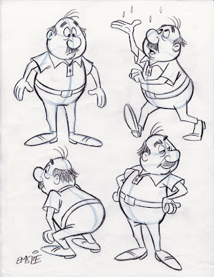
The sketch on the righthand side of the exploratory concepts page recalled a guy I used to work with years ago named George. Just like the rough sketch, George always had a big easygoing smile, with an upper lip and mustache that jutted out above a lower lip that was swept back with a receding chin. He was a really funny and delightful guy, so I thought I would base my character on his personality and physical traits, though this is not meant to be a perfect likeness of him, but rather, just using George as a starting point for developing this guy in a specific direction.
The veteran Disney animator, Eric Larson, often noted how he based the persona of Figaro, the kitten in "Pinocchio", on that of his own little nephew. This little kid could be stubborn and prone to temper tantrums, so Eric imbued his character with similar mannerisms, resulting in a character "type" that the audience would likely be familiar with and thus could easily relate to. This approach of basing characters on either one or a combination of several people you've actually met in your life experiences can result in richer animated performances and designs that really communicate a specific idea, rather than just trying to invent something randomly from scratch.
So, in developing this character based on my old friend George, I tried to recall specific instances from when we worked together. One thing I remembered was how George used to enjoy going out for the occasional game of golf which was compliments of one of our longtime vendors in appreciation for the work thrown his way during the year. By George's own admission, he was a lousy golfer himself, but he was mostly looking forward to the free meal he'd get back at the clubhouse dining room! George was a wheeler-dealer who loved to barter for things rather than pay good money, therefore a free lunch was never turned down. Another fond recollection I have of George is his impromptu, hip-shakin' Elvis impersonations. Again, that's something colourful and fun that can be utilized in the traits of this character design. By the way, George may have had a middle aged paunch, but he was not as hefty as this character, so that is still a direct holdover from the original concept. This character could be taken further, exploring more visual possibilities before refining it into a final design, but since this is just for the sake of this demo, I'm going to leave it there.
Lastly, here is a page of rough poses I did of this dumb mutt many years ago. You'll note that this pooch ended up as my life model in the cartoon heading up my last post. Fortunately, the black eye he'd likely acquired in a doggy rumble seems to have healed up nicely since the rough sketch.
Monday, September 3, 2007
Cartoon Construction 101
This week I head back to teaching 2nd Year Animation Character Design at Sheridan College here in Ontario. As John Kricfalusi has just posted this very informative article regarding character design on his blog, I thought I might tie into what he is saying once again. This post deals with what John describes as the "Functional" aspect of the design process - just understanding how simple forms placed together in an appealing manner is the foundation that an animator/cartoonist starts out with initially.
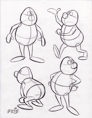
These drawings posted below are fairly simple, as they were done not for Sheridan students, but rather, for a more basic cartooning class I have taught informally at a couple local venues over the last several years. As such, they are not as "animated" as I usually prefer to draw, lacking a feel of "Squash and Stretch" that would give them more of an organic, pliable quality. But they serve the purpose of showing the concept of how to draw a simple constructed character in a variety of poses while maintaining consistency of form and proportion. Remember, this particular cartooning class included several students who were just beginners!
Here are the simple constructed forms, with guidelines to determine the tilt and angle of the head and body, as well as for consistent placement of all of the surface details. Though pictured in black line here for clarity, it is recommended you draw this stage lightly with a blue pencil in order to distinguish it from the finished outline and details you will be adding on top later.
Here is the finished character with all surface details added, and the light blue underdrawing still slightly visible so that you can see how it is done. As you can now see, those guidelines have helped in the accurate placement of his facial features, as well as the collar of his shirt and belt line too. Also notice how I've varied his expression and eye direction in order to create some personality and more visual interest. When drawing different tilts and angles of the forms, you also have to understand some of the basic rules of perspective in order to give the illusion of a solid form rotating in space while maintaining a consistent volume. Again, as John always tells beginning cartoonists, it's a good idea to learn what you can from the Preston Blair book, as that's quite honestly how most of we professionals learned in the beginning, back when we were young! Artistic styles may change over the years, but the fundamentals of good solid drawing do not.
PS: I dedicate today's post to young Chet, who was looking for some advice on how to construct a cartoon character. I hope this helps him out a bit.
Subscribe to:
Posts (Atom)